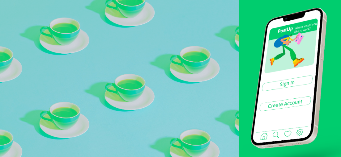
PostUp
Where would you like to work?
PostUp - A Design Sprint
is a new startup that wants to help remote workers find great workplaces between meetings.
PostUp
Users: We cater to tech-savvy adults who need a minute to conduct their business while waiting for their next meeting to start. These individuals are not necessarily from the area, have unique needs for their role as remote workers, and require a place to execute business.
DAy 1
Understanding & Mapping
Six remote workers were surveyed. While one remote worker was interviewed.
The table below shares their stories.
Let’s map out Chelsea’s journey to understand her experience further.
HMW
How might we save remote workers time when finding a workplace between meetings?
DAy 2
Sketches & Solutions
Using the strategy Crazy Eights, concepts were sketched, encompassing ideas for design and functionality.
I found the Crazy8s strategy helpful in pushing my ideas and producing varied visual resources toward my final decision. I used each step from Chelsea’s journey mapping to support the images floating in my head and then selected from the collections found in Mobbin. I researched multiple topics: Food & Drink, Graphics & Design, Lifestyle, Maps & Navigation, and Photo & Video. I have a good mix of competitor sites and screenshots with solutions for each process step.
Derived from Crazy Eights, wireframes were produced.
DAy 3
Storyboard
Here’s a little story I’d like to tell…
Through research, I found the solution I had sketched shared elements of multiple applications. To me, this means these elements are current and tested by users. This is important in the overall design because the point of the user experience is to be effortless and effective. My final solution is a combination of elements I had in my sketches. If you look, you will see the screens are a blend of ideas and do not settle on one frame. Like my solution sketch, my storyboard is done in Figma. I can efficiently lay out my ideas with Figma and quickly iterate on them. For me, it is more practical as l work through a design.
DAy 4
Prototype
DAy 5
Validate
To validate, I chatted with five users: two remote workers and three office regulars. They all frequently use mobile apps.
Feedback - The app's flow was smooth. Users seamlessly navigated, validating its intuitive design.
Functionality - Spot on. Tasks like finding a coffee shop and reviewing were a breeze. A highlight was having the Wi-Fi password visible in reviews—one less thing to hunt for!
Overall, they loved its ease and versatility, seeing uses beyond remote work. Three even envisioned casual reading or studying sessions using the app. All thumbs up! 🌟👍


