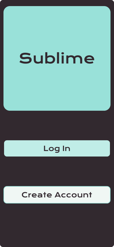
Sublime
Summary
It is safe to say as quarantine hit hard, so did the uptick in subscriptions. Now that the dust is settling and we are establishing our new normalcy, we may also question some of the charges on our monthly statements.
Objective
Identify users and create a solution for subscription consolidation, where users can have a comprehensive view of all current subscriptions and streamline cancellation and renewal processes.
Business Goals
Create a mobile-friendly app that can reach a broader audience.
Current user - Comprehensive view of subscriptions and spending
Returning User - Easily unsubscribe from the app
Consumer - be notified of upcoming payments and renewals
Interview Questions
Off the top of your head, how many subscriptions do you think you have? On a scale of 1 (very accurate) to 5 (talking out of my ass), how reliable is your count?
Have you ever forgotten about or missed a subscription renewal? If yes, what was the outcome, and how did you handle it?
How do you keep track of subscription costs and billing cycles?
What challenges do you face when tracking and managing your subscriptions?
What features or functionalities would you expect from a subscription consolidation app?
Are there any particular concerns you have about privacy and security when it comes to linking your subscription accounts?
How would you like the app to handle canceling or renewing subscriptions?
What pricing model would you find acceptable for a subscription consolidation app?
How important is it for you to have automated reminders for upcoming subscription renewals or expirations?
What payment methods do you prefer for subscription payments, and would you like the app to support various payment options?
How do you handle subscriptions for free trial services, and would you like the app to manage these effectively?
Interview Findings
Pain Points
Management of subscriptions
Payment organized - pay for all subscriptions simultaneously, various forms of payment.
Price increase/decrease indicated
The date paid and the next payment made clear
Cancelation and renewal
In as few steps as possible
Free trials
Would love for the app to manage free trials before the user is charged
Reminders
It needs to be effective, not just email/text, because those inundate - don’t really pay attention.
Quick, succinct, effective
Functionality and Features
-Personalized settings
-Reminders
-A comprehensive view of all subscriptions
-Data usage
-Organized by subcategories
Wireframes & Routes
Usability Test 1 (remote)
View all subscriptions
6/6 users felt this task was reasonable and user-centered.
Unsubscribe from Mobbin
6/6 users found this to be a straightforward interaction.
Check notifications
5/6 users successfully completed the task. It was suggested to place a number or red dot to signify notifications better.
Pay Mobbin
3/6 users successfully completed this task. The other half went to the settings screen, indicated on the right. Of the 3/6 users who did not successfully complete the task, two indicated they did not understand the icon, while the other did not read the directions.
Agree to legal terms
Legal terms were the most challenging task for users, with 2/6 successfully completing the task. Some ideas to rectify this are to create a modal or send an email asking for users’ agreement to legal terms.
Usability Test 2 (in person)
Overall Feedback:
The menu bar at the bottom must be higher on the phone; it interferes with the iOS home bar.
Change the colors of the layout.
Create a back option from Subscription View to Home.
Put a number or dot on the notification icon to make it more apparent.
High-fidelity Mockup
Introducing Sublime, an app that renders subscription awareness
Sentiments
A chat with my mentor and voilà! Tweaks made, retested, and guess what?…only minor feedback this round. Lesson learned: Design refinement never truly ends. It's about sifting golden insights from personal whims, all while wrangling the tech tools on hand.
Lessons Learned
Remote testing is quite an adventure! Key takeaway: clear instructions are a must, and expect a wee learning curve for newcomers. By User Test 2, we dove deep into the app's potential, and while we found minor quirks, figuring out which were game-changers was... tricky.
Next Steps
Next stop, Europe! I'm excited to see how our app resonates across the pond. 🌍🚀


